
Power Apps Branding Template V3
This post will cover the newest release of my Power Apps branding template for canvas apps! There are some new features and the visuals have been given an overhaul.
Imagine being able to create branding that applies to every new inserted item, allowing you/your App makers to spend time focusing on building rather than on correcting every item to be in line with branding guidelines. Well, you can!
Granted there are other methods for how to do this however they all have their pitfalls.
- You could create a theme record/table/collection in your App’s OnStart and then use ThemeName.Property on each control, however this takes a lot of time.
- You could create a screen with formatted controls of every type, and have users copy from that screen, however this assumes they will remember to always use those.
- You could create a duplicated reference-item screen, where there is a copy of the above-themed controls that reference the original screen full of referenced controls – this however comes at a performance hit once you have a larger number of controls within the App as they are constantly checking the property-state of the referenced control’s properties.
Wouldn’t it just be easier if we could set a few colours and the App deals with the rest Automatically? And if we wanted to override a few of the existing colours for certain items then it should be as easy as adding a property to the theme and setting it or setting the default for the theme.
You can save yourself, your team and your friends so much time by using this template to set up your branding/theming and then not have to do it again after that.
Why did I create this? §
The concept behind Power Apps is to be able to build ‘low-code’ Apps in a fraction of the time that pro-code Apps would take. The only problem with this is that the theming of controls and screens takes up a massive amount of time. I created the original version of this template to get around having to do that theming on every control.
There are over 2.5 million Power Apps developers, and if each of us is only spending one hour of our lives changing the theming properties of controls, then we’ve collectively spent 2.5m + hours, which is 285 years of 24/7 time, and that’s only for one hour each! We all know that we’ve spent WAY longer than that.
There had to be a better way! (There is always a better way!)
- Additionally in the more recent V3 version I have taken a stronger focus on enabling the accessibility features that I believe should already exist as a native part of the Power Platform, with the hope that these will be introduced in the future 🙂
Continue reading below to find out what these are!
Who is this App intended for? §
- Anyone who has ever spend time changing the branding or theming of a canvas Power App (ummm, so everyone?)
- Anyone who feels strongly about accessibility – the features I’ve added should be there by default
- Anyone who wants to either empower their citizen developers to help them develop clean and standardised theming throughout their jobs
- Anyone who wants to create pre-branded templates for their clients that enable their clients to easily generate Apps with their company branding/theming
- Everyone!
How do you use this? §
TLDR: §
Download the .msapp file from the Power Apps Community Forum post here and then navigate to https://create.powerapps.com and open the file you downloaded.
There are some TLDR Options here, and you can read if you want to see how each screen and pattern could benefit you.
- Option 1:
Edit the App OnStart to change/add/remove the list of themes.
Remove any un-needed screens.
Start inserting new controls.
Use the theme screen to allow your users to choose their theme. - Option 2:
Edit the App OnStart to change the default theme and the default control properties outright and don’t use the themes.
Remove any un-needed screens.
Start inserting new controls and components. - Option 3:
Edit the App OnStart to change the default theme and the default control properties outright and don’t use the themes.
Remove all screens.
Remove any references from the OnStart to those screens.
Start inserting new controls and components.
You can safely remove all of the screens and start with a Blank template.
I would suggest keeping the accessibility code from the components for Font Sizes and for Accessible Theming and using those on your own accessibility controls.
I’ll explain the screens in more detail and how it all works below:
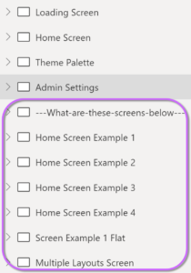
The Loading screen §
The first screen you will see is the Loading Screen
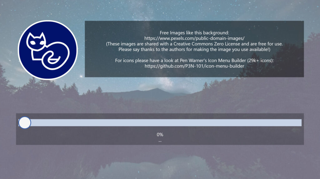
The loading screen is important, and I’ll explain why – When a user opens your App, you want them to get into the App as fast as humanly possible, and not spend any significant time in the pre-loading phase before the App opens. There is a study by Microsoft (see reference in quote below) that you can read, or, if your attention span has already waned, then don’t read it – the point is that when your user opens the App, you want to engage them visually as soon as possible. This is why you should never have any significant data loads within the App’s OnStart. In addition to this the “Non-blocking OnStart” rule that is in preview will likely be rolled into the main App experience as it makes sense to get makers incentivized to shorten their OnStart process.
“We are moving from a world where computing power was scarce to a place where it now is almost limitless, and where the true scarce commodity is increasingly human attention”, Satya Nadella
Microsoft Attention Spans Research Report | Attention | Advertising (scribd.com)
In the loading screen, I have a timer, tmr_LoadingScreen_LS, which is set to start when the OnVisible for that screen is run and is set to 5000 milliseconds (5s). During the OnTimerStart property, you should have your data loaded in and then navigate to the required screen. The OnTimerEnd function also navigates to the required screen.
The idea behind this is to have your data loaded within a reasonable 5 second timeframe or else navigate while it is dealing with the remaining parts of the request. You should set the LoadingText variable to describe what you are currently doing, i.e “Loading Users from List ABC”. If there is any data that needs to be loaded before the Required screen, then prioritize that in your loading order. The loading screen’s slider bar will fill itself as that timer increases.
The other pattern you can use is to not have a timer but instead have all of your data loads done concurrently (and sequentially where applicable) during the OnVisible of the loading screen, then update the LoadingText variable each time you do, also changing the value of the width of the btn_LoadingBar_LS at the same time. This will ensure that all data is loaded before you navigate to any other screens
I have left links to a free-for-use image site and to Pen Warner’s Icon Menu Builder for you to get image and icon resources for your canvas Power Apps.
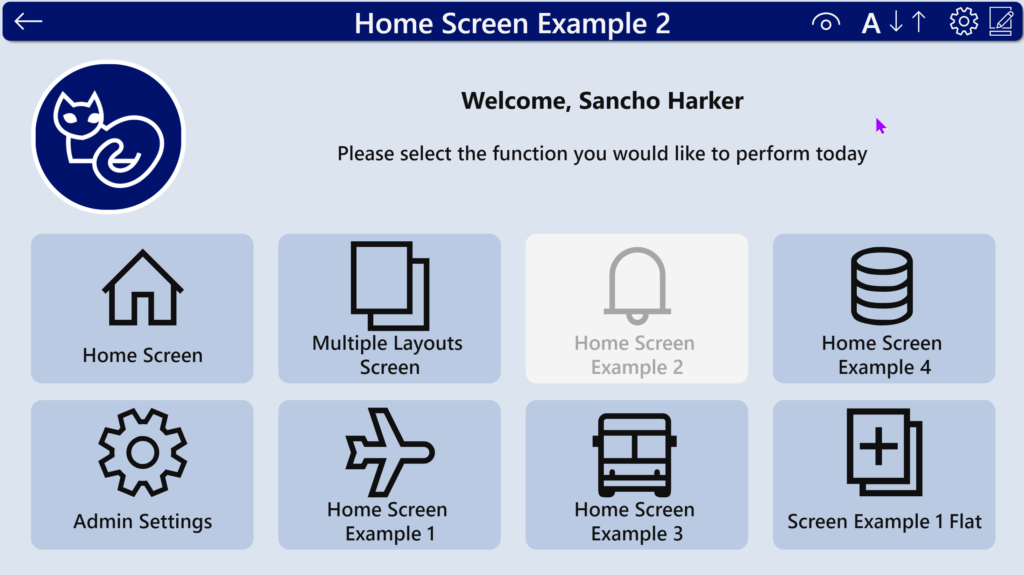
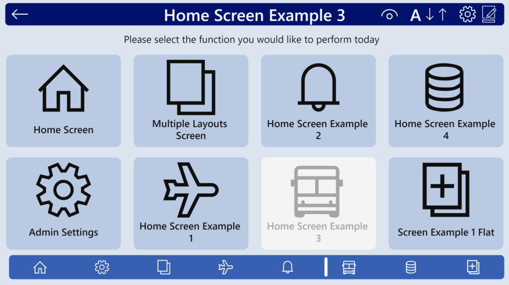
The Home Screen §
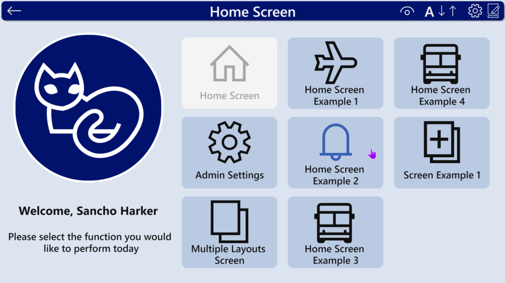
This screen should be your landing page for when your loading screen has completed. The usual pattern used is for this screen to be the central navigation point for the rest of your App.
I have included a few other example layouts in the App:

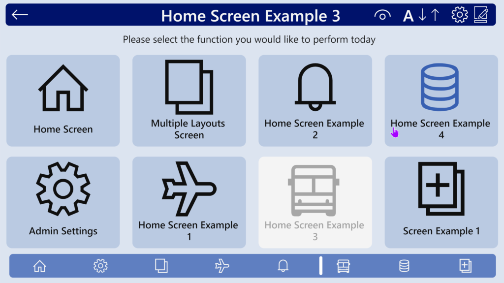
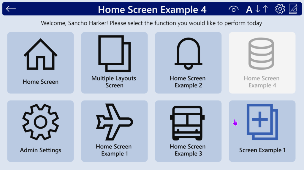
These screens should hopefully help and give you some ideas for presenting your content in a visually-pleasing way.
In order to talk about the upcoming screens we need to talk about Theming:
Theming §
The App’s OnStart defines four global variables that are then used for default theming of controls and for generating the Themes to choose from.
- ThisTheme
- FontSizes
- ControlsTheme
- ControlsFontSizes
ThisTheme §
ThisTheme defines the base colours (1-3) and their respective text counterparts (text colour should always be correctly contrasted against its pair base colour).
These are then used to define the colour properties for the Control-Level properties.
ThisTheme also defines the base font and base font size. These are then used to determine the FontSizes, which are then used to determine the Control-Level font sizes.
ThisTheme also defines the default Text Colour which is used on Controls that have a transparent background.
ThisTheme also defines the Dark Mode property, which is used on the inner background of checkboxes and radios, and the background of all Forms and Screens.
Set(
    ThisTheme,
    {
        Name:               "Microsoft Blue Light",

        Color1:             RGBA(186, 202, 226, 1),
        Color2:             RGBA( 56,  96, 178, 1),
        Color3:             RGBA(  0,  18, 107, 1),
        Color1Text:         RGBA( 15,  15,  15, 1),
        Color2Text:         RGBA(245, 245, 245, 1),
        Color3Text:         RGBA(245, 245, 245, 1),

        defaultTextColor:   RGBA( 15,  15,  15, 1),

        Font:               Font.'Segoe UI',
        FontSize:           14,

        DarkMode:           false
    }
);
FontSizes §
FontSizes sets the standard sizes of font which are then used to define font sizes at the Control-level.
Set(
    FontSizes,
    {
        TextMain:      ThisTheme.FontSize -1,
        TextEmphasis:  ThisTheme.FontSize +1,
        Content:       ThisTheme.FontSize +2,
        Title:         ThisTheme.FontSize +6,
        SubTitle:      ThisTheme.FontSize +4,
        AddPicture:    ThisTheme.FontSize -3
    }
);
ControlsTheme §
This is where the magic happens.
The variables here are referenced by default for every new control. If you change a value here it will affect every new control created and every control that has been created previously that is still pointing to these values.
This new V3 version of the template has properties for every control that can be customized.
Additionally, there are some properties that you can set with this template that are not possible to do from the normal canvas App editor.
List of supported controls:
Label, Button, Text Input, Pen Input, Dropdown, Combobox, DatePicker, Listbox, Checkbox, Radio, Toggle, Slider, Timer, Image, Camera, Barcode, Video, Stream, Audio, Microphone, AddPicture, Import, Export, Chart(s), Gallery, Icon, Attachment, Form, Screen, DataTable, PdfViewer
List of things you can change with this template that are entirely IMPOSSIBLE from a normal Canvas App:
- Override default colours and fonts for all new inserted items
- Override the default inserted screens to use the theme you’ve set up
- DataTable border-lines between headers
- DatePickerSelectedDateFill, DatePickerHeaderFill
Let’s look at the Label section to see how these properties are set:
Set(
    ControlsTheme,
    {

        LabelTextColor:    ThisTheme.defaultTextColor,
        LabelFill:         Transparent,
        LabelBorderColor:  ThisTheme.Color2,
        LabelFont:         ThisTheme.Font,
As you can see, they reference the ThisTheme values. You could also set them to specific colours if you wanted your defaults to appear as those colours.
In this case the fill is set to transparent, this is because on the insertion of new templated screens, the label is used extensively for headers and other sections and overriding this fill will mean the new insert-screens will have fill values that may not match the rest of the new screen items.
You can also set these to logic-based values that are evaluated every time the OnStart is run:
CheckBoxInnerBackground:  If(
                             ThisTheme.DarkMode,
                             ColorFade(ThisTheme.Color1, -50%),
                             ColorFade(ThisTheme.Color1,  50%)
                          ),
Additionally:
You can now create a theme that overrides any of the specific properties set during the ControlsTheme with a control-level override.
We don’t set the Font size within the ControlsTheme, that is done in the ControlsFontSizes ( this is to isolate it from the themes, so that we can have a font-size change on-the-fly without re-applying the theme properties every time )
ControlsFontSizes §
This is where we set the font sizes for all of the controls. We can use Set() in other parts of the App to change these or to make adjustments on-the-fly. These values are currently based on the FontSizes variable
Set(
    ControlsFontSizes,
    {
        LabelFontSize:                FontSizes.TextMain,
        ButtonFontSize:               FontSizes.TextEmphasis,
        InputFontSize:                FontSizes.TextMain,
        DropdownFontSize:             FontSizes.TextMain,
        ComboBoxFontSize:             FontSizes.TextMain,
        DatePickerFontSize:           FontSizes.TextMain,
        ListBoxFontSize:              FontSizes.TextMain,
        CheckBoxFontSize:             FontSizes.TextMain,
        RadioFontSize:                FontSizes.TextMain,
        ToggleFontSize:               FontSizes.TextMain,
        TimerFontSize:                FontSizes.Title,
        BarcodeFontSize:              FontSizes.TextEmphasis,
        AddPictureFontSize:           FontSizes.AddPicture,
        ImportFontSize:               FontSizes.TextEmphasis,
        ExportFontSize:               FontSizes.TextEmphasis,
        ChartLegendFontSize:          FontSizes.AddPicture,
        GallerytitleLabelFontSize:    FontSizes.Title,
        GallerysubtitleLabelFontSize: FontSizes.SubTitle,
        GallerycontentLabelFontSize:  FontSizes.Content,
        AttachmentFontSize:           FontSizes.TextMain,
        FormTitleLabelFontSize:       FontSizes.TextMain,
        DataTableFontSize:            FontSizes.TextMain,
        DataTableHeadingFontSize:     FontSizes.TextEmphasis
    }
);
Setting Chart Colours §
The ReservedChartColorSet variable is set immediately after this – it sets the colour array to use for all charts inserted via the ribbon.
Creating Additional Themes §
The next part of the OnStart creates a collection of themes that can be switched between either using the theme choice screen I created or one of your own creation.
ClearCollect(BrandingColours,

    {
        Name:             "Microsoft Blue Light",
        Color1:           RGBA(186, 202, 226, 1),
        Color2:           RGBA( 56,  96, 178, 1),
        Color3:           RGBA(  0,  18, 107, 1),
        Color1Text:       RGBA( 15,  15,  15, 1),
        Color2Text:       RGBA(245, 245, 245, 1),
        Color3Text:       RGBA(245, 245, 245, 1),

        defaultTextColor: RGBA( 15,  15,  15, 1),

        Font:             Font.'Segoe UI',
        FontSize:         14,

        DarkMode:         false
    },

..........
Multiple themes are created this way, and (DRUMROLL):
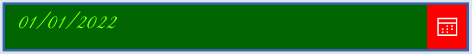
We can now override ANY of the control-level properties for a theme! All you need to do is add one of the properties that we set during ControlsTheme and it will set it for that theme, i.e. if I set the following, I can change the default datepicker:
DatePickerColor:             Chartreuse,
DatePickerFill:              DarkGreen,
DatePickerIconFill:          White,
DatePickerIconBackground:    Red,
DatePickerSelectedDateFill:  DarkOrange,
DatePickerHoverDateFill:     LightCoral,
DatePickerHeaderFill:        Fuchsia,
DatePickerFont:              Font.'Great Vibes',
Then my DatePicker will look like this
(hint: please don’t make your DatePicker look like this, it’s terrible 🤣):
Adding your own theme §
To add your own theme, you will need to add an entry to the collection (and remove any that you don’t want shown in the datepicker). You can use the code I’ve commented out to add your own theme or you can edit one of the existing items.
CAUTION
If you are going to use my theming screen and the individual overrides for each theme (your other option is to edit the base ControlsTheme to your required colours and not have the Themes collection), then you will need to keep the “Control-level Override” theme in the list of themes. This theme allows the schema to be maintained for any other possible control properties, if you remove it and try add a custom theme then you will get loads of errors.
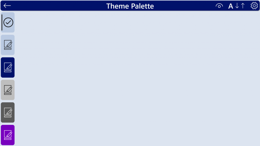
The Theme Palette Screen §
This screen allows the user to select which theme they wish to use. The potential for this screen can also be increased by potentially storing your user’s chosen theme to a datasource, and having this theme load when the App is started. At present the App is datasource-agnostic, so you will need to create the code and logic for that yourself if you wish to give users that additional functionality.
When you first reach the screen, it has no theme selected, so you can select one from the left-hand menu:
When you select a theme from the left-hand side, it will set some variables and display the theme on the various controls:
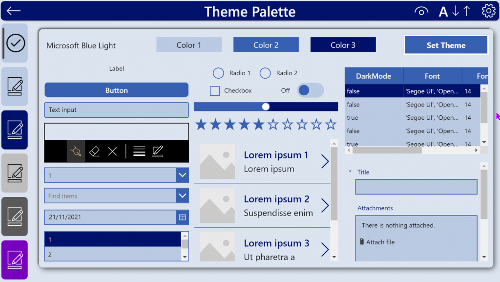
You can then choose the Set Theme button in the Top Right to Apply this theme to your app for this runtime experience. (To enable the App to use this by default we would need to store this preferred choice in a datasource, and then have it read during what that particular user’s choice is and Apply that theme.)
Here we have an example of where this Power Apps branding template reaches above expectations: control-level overrides for individual properties of controls.
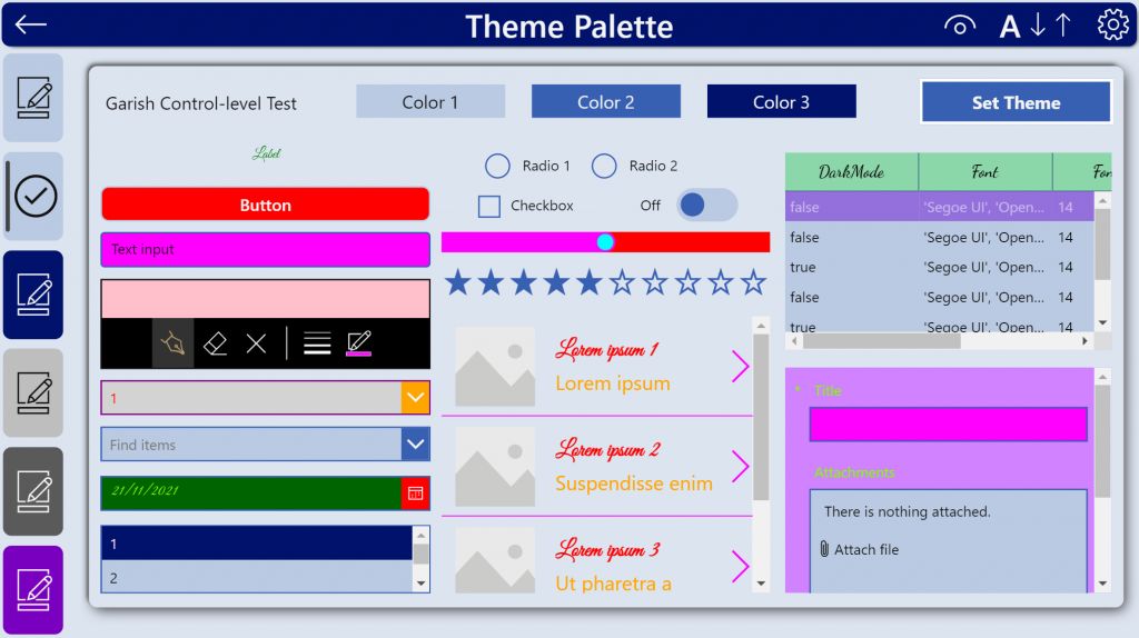
In this picture we have different:
Fonts,
Colours (sorry I went a bit off-brand here, colours were chosen for shock value!),
Fontsizes,
Datatable has been colour-customized,
Default form has been made to use different colours,
Gallery has different defaults
…the possibilities are endless!
Once we hit Set Theme, these changes will apply to all inserted new items or any existing items that have been inserted in this Power Apps branding template. You could also set these to default to those colours by editing ControlsTheme directly in the OnStart if you want that level of customization to be your default.
Now that I have set the theme, if I insert a new screen, add a form, it will use those default colours of the theme. If I set these by default then there is no need to change the theme (or to have alternative themes)
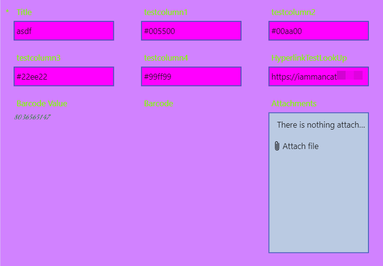
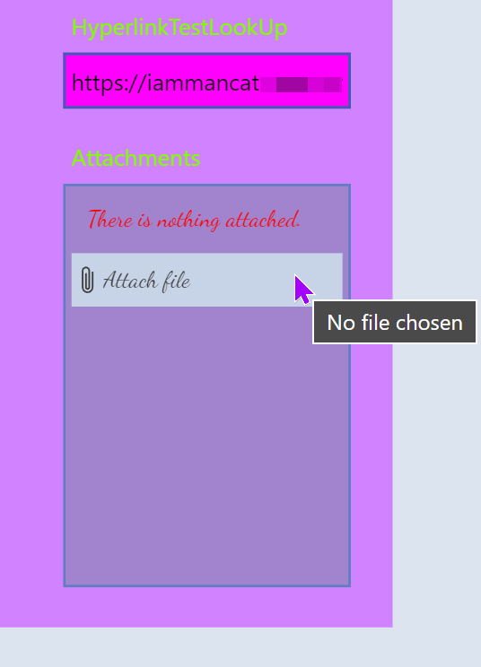
If I don’t like the way the attachments look in this theme, I can:
Edit the theme and add a few lines to alter the properties (or edit the default ControlsTheme if I am not using themes)
AttachmentTextColor:    Red,
AttachmentFill:         RGBA(22, 137, 55, 25%),
AttachmentBorderColor:  Fuchsia,
AttachmentFont:         'Dancing Script',
AttachmentItemColor:    White,
AttachmentItemFill:     Brown
Trigger the OnStart, Set the theme again, and voila:
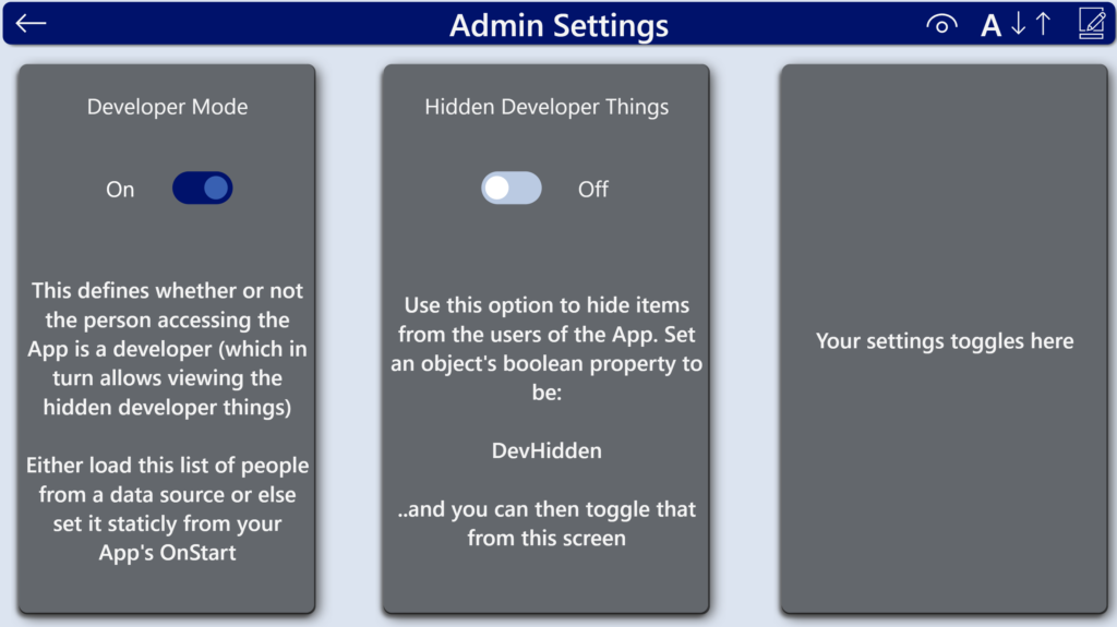
The Admin Screen §
This screen (or similar) should be a staple in all of your Apps – this is where you store your admin settings, features, flags and information. It is fairly common for me to also have some kind of useful debug information within this screen.
I have included two basic concepts (again, same as with V2 of the template), however you should add to this whatever will help you administer your Apps:
DeveloperMode – shows or hides certain features throughout the App, such as being able to navigate to this screen from the menubar.
DevHidden – used to set the visibility of items within each screen for items that should only be visible to the developer.
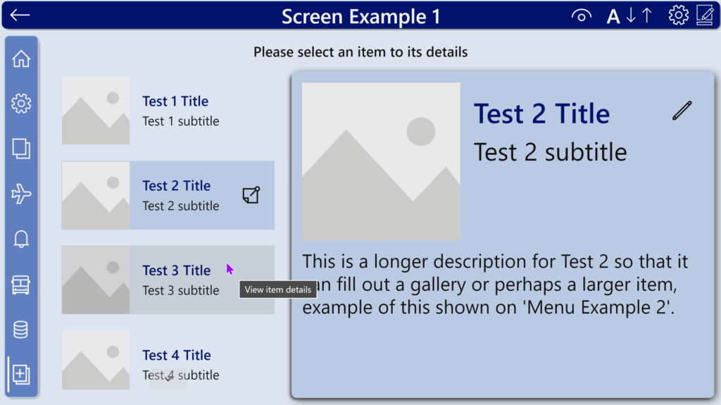
The other screens
These screens are just for inspiration and provide you with a few examples of how you could lay out your Home Screens or your data screens. Please feel free to use or copy these for your own purposes.
Accessibility features §
This version of the Power Apps branding template now has the ability to set font size and black-and-white accessible theme on-the-fly. This is achieved by changing the ThisTheme and ControlsTheme variables (for the accessible theme), and by changing the FontSizes and ControlsFontSizes.
The code for this can be found on the components supplied with this App, so if you want to make your own controls/methods, please feel free to take that code and modify it as you see fit.
Thank you for reading if you got this far!
I hope this Power Apps branding template helps you customize your Apps to a level you never thought possible and that the screen ideas inspire you to create your own (especially if you are new to Power Apps!)
I’ll be putting out some very short videos soon covering the TLDR Options 1 to 3, so if you’re interested, make sure to subscribe to my YouTube channel.
OLD V1 version:
If you’d like to see the original V1 version post (to see how far we’ve come), it’s here.
Hi! Is it possible to disable “Navigate Back” (cmp_Header) button for some of the screens?
Hi David!
You can modify the component to have a boolean property, BackEnabled, and then make the back button’s visibility (in the component editor) based on the value for that input property. That way you can define each instance on each screen as to whether it shows or not 🙂
Cheers,
Sancho
I figured it out: I created a new Boolean property named NavigationMenuButtonsEnabled, and set it to the button. Posting the solution here for other wonderers. Thanks! 🙂
Hi,
I cannot see the menu items from the gallery view when running and testing the app on an ipad.
Hi Ribesh,
This is likely the iPad failing to render SVG images. In that case I would recommend using the alternative property of the menu collection, which has instead uses a Power Apps icon as the image instead.
Cheers,
Sancho
Hi Sancho. Thank you so much for making our lives so much easier!
On version 3.4, I get a warning “Invalid argument type. Cannot use Boolean values in this context.” I downloaded version 3.5 and do not get the error, so we are good there.
My question is, how do I remove that warning from the apps created with version 3.4. I tried importing the component, but that did not work. Short of copying all objects into version 3.5, is there a way to get rid of the warning?
Thank you very much!
Hi Francisco,
I actually found a quicker way to get around this than the fix I implemented in 3.5 – You can get around this by modifying the component in the Template (or in any apps you have already built) and changing the SetAccessibleTheme & SetFontSize property to an output type of ‘none’ (it was record before). Then in the app settings under upcoming features, turn off the retired feature ‘Disable component behaviour property return type check’. Save and reload and this should resolve the issue.
Cheers,
Sancho
Thank you for creating such an amazing time saver for all of us. You are my Hero!
I have the following issue:
I have created a new screen named “Log”.
Then copied some controls from the “Theme Palette”.
Controls in the new screen reference “ChosenControlsTheme”, e.g. “ChosenControlsTheme.AttachmentHoverColor”,
“ChosenControlsTheme.EditFormFill”.
All the colors are black in “Log”, if I don’t go to the “Theme Palette” and select item from the “glr_PaletteChoice_TP” such as “Microsoft Blue Light Theme” for example.
Can I have a preselected theme, and not have black controls somehow?
I am correct assuming that I can copy controls from “Theme Palette” and use them on my new screens?
Thank you again for being awesome!
Have a great day!
Hi!
You don’t need to copy controls – you can insert controls using the normal ‘insert’ function and those controls will have the theming applied to them automatically – that’s the whole beauty of this template is that it themes the default controls.
The controls on the Theme palette screen are modified to only work on the them palette screen as they need to have multiple themes applied from the gallery whereas everywhere else in the app it uses only one theme, sorry for any confusion here 🙂 This would be why they show up black, as they can’t find the item to reference as they are no longer in the gallery.
Cheers,
Sancho
Hello Sancho,
Thank you for creating this great tool for all of us.
I am wondering about Loading Screen.
I have set a variable on Loading Screen.tmr_LoadingAction_LS.OnStart:
Set(defaultRun, Text(Today(), “mmmm yyyy”));
When I use it on Home screen defaultRun is blank.
Should we use Loading Screen.tmr_LoadingAction_LS.OnStart to create such variables, or we should do it elsewhere?
Best Regards,
Dzhyuneit.
Hi,
I think that may be the timer is not running? Timers in Power Apps only run when in play mode, so you have to either use the Play button in the editor or run the app separately to test timers.
In this example, I would just put that code in the Loading Screen.OnVisible as it has no reliance on any datasources and will complete immediately 🙂
Cheers,
Sancho
Thank you for creating such an amazing time saver for all of us. You are my Hero!
I have the following issue:
I have created a new screen named “Log”.
Then copied some controls from the “Theme Palette”.
Controls in the new screen reference “ChosenControlsTheme”, e.g. “ChosenControlsTheme.AttachmentHoverColor”,
“ChosenControlsTheme.EditFormFill”.
All the colors are black in “Log”, if I don’t go to the “Theme Palette” and select item from the “glr_PaletteChoice_TP” such as “Microsoft Blue Light Theme” for example.
Can I have a preselected theme, and not have black controls somehow?
I am correct assuming that I can copy controls from “Theme Palette” and use them on my new screens?
I use V3.
Thank you again for being awesome!
Have a great day!
Oh my goodness! I have never been more excited to start a new PowerApps project than I am right now! Just downloaded your theme. Love all the context and advice included with your code! You’re my hero. 😉 P.S., big shoutout for the accessibility/inclusivity piece.
Thanks so much, I really appreciate the sentiment – yes I tried to include as much help inside the file as I could! The accessibility available in the template should be something that’s available natively in the product, so until it is I hope everyone implements things like this in their Apps or at least tries to make their apps more accessible and inclusive 🙂
How can i add to this? As in i want to add select properties like border thickness etc. Just a handful of properties.
I tried just adding those to the onstart code and it does not work. Anything I need to do?
Hi Amal,
You would need to add those properties yourself to each applicable control and either set them staticly in the Themes.json file, or set them to a variable in the Themes.json and then set those during app onstart. If you extract the msapp file, you can look at the Themes.json file inside it. I have some brief instructions on how to do that in the linked page within the “How do you use this section”.
The reason I didn’t include borderthickness, was that once you reach a certain number of referenced values/properties, they cause excessive delays due to lookups to variables – this may no longer be the case as it was two years ago that it was an issue, so you are welcome to try adding those yourself.
Cheers,
Sancho
Hello,
thanks a lot for this, it’s will be a lot easier to design an app.
I have a question, if I want to update your msapp with my color theme info, which files do I need to edit ? I exported the msapp with 7zip, and I have all thoses json files:
– checksum
– ComponentsMetadata
– Header
– Properties
And these folders with json files as well :
– Reference (DataSources.json; Resources.json; Templates.json; Themes.json)
– Controls (12 files with number as name)
– Components
Do I need to edit all of theme ?
Thank you 🙂
Hi,
The base colours are all defined in the app via variable during the OnStart process, there are almost none defined in the Themes.json as that was all edited to point towards variables. If you need to add your own theme, there is a section in the OnStart where themes are defined, or you can assign the particular colours for each property in there as well – there are example themes there with overrides as well – these overrides would override the default properties that are set during this App OnStart.
Cheers,
Sancho
Hi Sancho!
First off, great content on your blog! I really appreciate it.
I read this entire post and downloaded the solution and tried it, it works great. For my use case I would like a single button (like the “Set theme” button) that sets ONE predefined theme. So that my team can copy the button into their apps, click it and it applies the theme.
Do you think this is possible?
I would like to use your solution, but when I try to open the file (iAm_ManCat Branding Template V3.msapp) in PowerApps, I always just get an error message that something went wrong. I also tried in the Microsoft Developer environment, but no chance.
Do you have a tip what else I can try?
Hi Petra,
Are you trying to Open it or are you trying to Import it? This file is for opening, not for import.
You will need to go into the editor, and click Open from inside there, using the “…” menu at the top of the editor.
If you’re still having issues doing it that way, could you let me know if you are able to download (not export) one of your own apps and Open it in the same way? I have seen from others that some tenants like GCC are preventing Open of solutions altogether.
Cheers,
Sancho
Hello Sancho
Thank you very much for your reply.
Meanwhile I found out that my business laptop caused the problem. It’s quite secured and the opening of locally saved apps is blocked. With my personal laptop I could open the app without any problems.
I think it’s great what you have developed. This will make my custom design work so much easier.
Regards
Petra
Are there any legal restrictions on using the template? Is it considered open source? Thanks!
No Legal restrictions – I made this for people to use, build upon and share. Would be nice if you kept my name in a comment somewhere inside whatever you build, but it’s not a requirement 🙂
Hello Sancho, thank you for this wonderfull work !
I have a question, when i add a new button control, it comme all default value like “ChosenControlsTheme.ButtonColor”, but when i add a new gallery, it is not the case, the font size, font color, etc. are not the dafeult.
Did you not configure all those properties or i have a problem ?
Thank you in advance for your help
Hi Kaly,
The problem here is that Microsoft updated the galleries in Power Apps a few weeks ago, which broke all of the defaults code as they overwrote this.
I will try get a new version out with fixes as soon as I can,
Cheers,
Sancho
Hello Sancho,
i was wondering why it didn’t work. I thought i had a problem! Thank you for explaining it!
Thank you for this solution!
Best regards,
Selin
After years in a MS web development environment where HTML and CSS are common whatever the language, you have brought design sanity to PowerApps. Thank you! I learned of you from my Matthew Devaney blog and have been experimenting with my own Power Apps using your Theme framework and have been amazed at the ease of bringing complex theming to them. However, a question: Can one have individual fonts and text sizes for each theme? I’ve tried it and get lots of errors. Thank you.
Never mind. After reading the entire app.OnStart text, the answer is clear, especially after looking at the Garish Control-level Test.
Hey Fritz,
I’ve just seen these comments, Thanks for the compliment regarding design of Power Apps 🙂 Glad you found what you needed in the OnStart – the garish example showed how to do the individual overrides but I guess I also could have done more tutorials etc for using this but struggled to find the energy to so tried to contain as much of the information inside the App itself to keep it self-contained.
Thanks again!
Cheers,
Sancho
Should this work in the GCC environments as well? I keep getting “There was an error opening the file.” with simply a session ID
Hi Brian,
I’m not able to answer that – the GCC docs don’t mention anything about the ability to open Apps, but I would suspect it has to do with data concerns and importing data that shouldn’t be allowed via an app. I don’t have access to any GCC tenants so can’t test it myself, but I would try and see if you can Save As/Open a blank app, and if you can export/import an app – if you can export/import but not open/save as then I could make you an importable copy to use
Cheers,
Sancho
Hi!
Great template for ensuring a organizational design across apps.
Have you found a method to similarly apply this to any behavior/action properties of the controls? Such as OnSelect, OnChange etc. 🙂
Hey Daniel!
I certainly tried, many times, but sadly no – there’s no way to default the behaviour/action properties – the IDE only picks up defaults from the themes.json file so there’s only UI info in there, the rest is defaulted by using the IDE itself rather than entries in the msapp (for the record, they are in there, it just doesn’t read them as defaults to be used).
Cheers,
Sancho
Hi Sancho,
Aww, to bad. Perhaps one day in the future…
Another question then 🙂 I was messing around with the Templates.Json to see what could be achieved with this. I had the idea that it would be nice with two different type of buttons, a primary button with a filled design and a secondary button with a outline design.
I managed to create an additional button that could be used in the app, but I might have broken some referencing somewhere, because the coloring/design did not come out as intended.
Have you tried something similar? If so, any success with it so far?
Best,
Daniel
I have also tried creating additional styles for buttons and other objects, but the Power Apps editor doesn’t pick these up correctly and from what I can see there’s a server-side template that it looks at for the controls it can interpret, so yeah I didn’t have any luck with that either unfortunately.
Great Template. I have been promoting this with my customers. I haven’t seen anything else quite this nice.
Thank you very much Sancho for this brilliant template.
Need your help for one thing, I was trying to apply one theme to my already existing app.
I downloaded msapp file, unpacked it using vs code extension for power platform, changed the entire content of Theme.JSON file with one new app that uses this template, then used the powershell to convert the main app into zip and tried to import it, but I am getting error and it does not get imported successfully.
Am I doing something wrong here?
Would it be possible for you to brief me about how we can apply the themes to existing app please?
Many Thanks in Advance! 🙂
PS: The App OnStart code is already there for initialisation of Theme, I just removed not requried items from Themes collection and copy pasted other stuff as it is from new app to main app’s OnStart, so both are same at the moment.
Hi Deval – The PowerShell script creates a .msapp formatted file rather than a .zip (the msapp is an archive, but its treated differently, so if you renamed it to zip then that won’t work), so if you have tried to import that then it won’t work as its not designed to be imported – you will need to use File > Open from within the Power Apps Studio to open the file and it must be the .msapp format 🙂
Thank You for the hard work and for sharing it with the community. I’m new to the Platform. I have downloaded the .msapp and when I try and upload the app it continually fails ” Wrong Format expected .zip”. I’ve used the PowerShell script to create the zip file by commenting out the rename App portion. A little guidance would be greatly appreciated.
Hi Tony,
This is a .msapp file so you don’t need to convert or change it into anything – the PowerShell script is for if you have extracted the .msapp into a folder to make changes to the underlying files and need to recombine it back into an msapp file, it is not designed to create .zip files, it creates an archive yes, but .msapp files are archives containing Power Apps canvas App data.
It looks like you tried to import it rather than open it – You can open any .msapp file within Power Apps Studio by going to ‘File > Open > Browse ‘ – the quickest way is to create a blank app, then once the editor loads, click File> Open> Browse
Cheers,
Sancho
Thank you for creating such a wonderful template and saving us from spending countless hours in UI designing. May be i am getting greedy but no harm in asking :), any plan to make this template responsive?
May i know how i can apply background color to horizontal / vertical containers?
Hi Muhammad,
Unfortunately we are limited by what controls the Power Apps team use in their themes.json for defaults, and containers are not included in this at present.
Cheers,
Sancho
Hello,
I would like to take the time and thank you for creating this. Saves a ridiculous amount of time.
Thank you for saying that – I really do appreciate it. I spent a lot of time working on this so that others don’t have to spend that same amount of time! 🙂
On the OnStart section to set the themed Font, how would I use a proprietary font? Currently in PowerApps, I would type the name in double quotes in the Font property of a control.
Thank you.
Nvm, I was able to figure it out. Thank you!
How could I go about setting more defaults? I want to set a default screen background image, and I want to change label colors in forms so that it is different depending on whether it is an edit form or a view form. Thanks
Hi Muhammed, unfortunately we can only work with what properties are exposed in the themes.JSON file – background colour is a default property of a screen so can be modified, but an image is not currently supported (even in the editor – you can’t change the background to an image, you have to insert an image and make it the size of the screen, so we can’t affect that by default). The forms use the same types of label types within them, so I don’t think its possible to change them contextually like you are asking. We are unfortunately limited by the properties and objects exposed by the Power Apps team. I do hope that they allow us to customize further in future!
Hi Sancho, once again thanks so much for creating this. Where can i take a look at the JSON file?
Is borderthickness a property mentioned in it? OR have you covered everything part of the JSON?
If you extract the msapp file, you can look at the Themes.json file inside it. I have some brief instructions on how to do that in the linked page within the “How do you use this section”
Hi Sancho – this is great! Is it possible to configure other properties not explicitly called out already in the control level properties, for instance margins and padding? Many thanks!
Hi Mark, yes it is – however the number of additional properties to do so resulted in an extra 125+ properties that need to be set and referenced, and this came at a slight performance hit so I’ve not included those.
Hello,
Great work !
I the template the properties
ControlsTheme.ButtonRadiusTopLeft
ControlsTheme.ButtonRadiusTopRight
ControlsTheme.ButtonRadiusBottomLeft
ControlsTheme.ButtonRadiusBottomRight
were missing. So I just added it and it works.
I embed all of this in a Component Library. Seems working but I have to test it deeply.
I have a question. Going through the themes.json there are a lot of “style” definitions. There are multiple for labels and buttons etc. Where do they come into the game? How does one reference one of these styles? Or are they styles PowerApps automatically applies when creating a label in a certain context?
You are correct – Power Apps uses these when creating the Insert>New Screen templated controls for each screen – there is currently no way to insert or reference these unfortunately as you can only insert the default type of control – this is a limit imposed by the IDE itself. If you find a way to reference them please let me know!
Hi. Can you please describe how I can add / import these into an existing Power App?
This template is based on a manipulated .json file in the .msapp file. It is a bit of a hassle to change files within the .msapp file. You could add your app to Github and swap the themes.json file. Not sure whether that would do the trick, though.
Such an incredible effort. Thank you for sharing. That really saves time!!
I have a question: How would I set all labels to bold font weight. Is that possible?
Thanks for the template! One question: Every time I run the app i get a divide by zero error on first load. Any ideas?
Hi Bob, there is a divide by zero issue whereby Power Apps is looking at a value before a Countrows() action has completed, which results in the rows equating to zero which it then divides by – I should have resolved this in a recent release so please try download it again.
After reading through the post, it definitely helps to bring this branding template to my apps. However I will be much interested if we have videos demonstrating about creating new themes out of this and/ or modify existing variables/collections too. This can give more visual appeal of how to use it. I am sure am coming back to read this again until I make best use of this. So should have so much effort for all 3 versions. All I can is Thank you so much giving so much to the community and am running short of words. 🙂
Hi Ramesh, thanks for the kind words, I am currently in the process of making some videos for this 🙂
Thank you, thank you, thank you! I’m spending today to look through this and make it my default branding app by adding all my components and our organization’s colors to it. Love the new home screen choices.
Thank you! I’m so glad you like it 🙂