
Simple Gantt in Power Apps
Today we are going to create a simple Gantt in Power Apps. I’m not even sure that it’s possible to create one simpler than we are going to do today!
That being said, as a simple Gantt, don’t expect miracles like looking at multiple years – if you want that kind of functionality then expand on this simple example – don’t forget to share with the community when you are done, #SharingIsCaring after all 💜
All we need is two galleries and three labels.
The Data needed for your Gantt in Power Apps
In its simplest form, we want a datasource with items that contain two dates and a descriptor like a Title. We can expand on this as we need, but for the simplest example, just these three will do.
Creating the Gantt in Power Apps
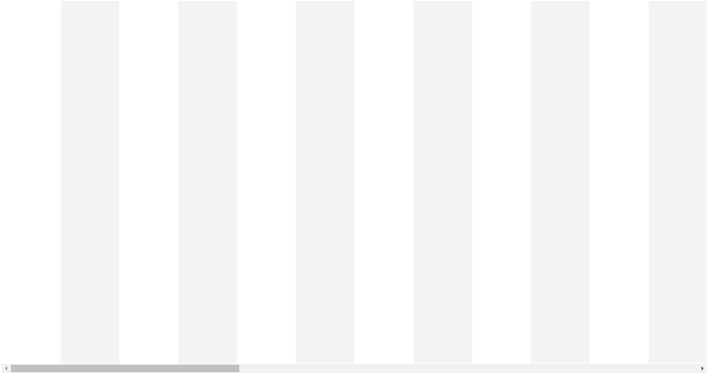
Let’s start with the container, which will allow us to show the months of the year.
Insert a Horizontal gallery, I will call mine gal_MonthYears_PS, and make its Template size:
Self.Width/12This will ensure that by default it shows a whole year no matter how far you look through the data.
Now we are going to be defining the datasource for this gallery – what we want this gallery to do is show the months of the year so that we can see visually where each project will lie (ie in Gantt format). In this example, we will start the date range from the first month of the current year, and then extend it another 36 months (3 years). We do this by putting the following code in the datasource property of the gallery:
ForAll(
Sequence(36,1,1),
{
MonthYear: Text(
DateAdd( Date(Year(Today()),1,1), Value - 1, Months),
"mmm yyyy"
),
ID: Value
}
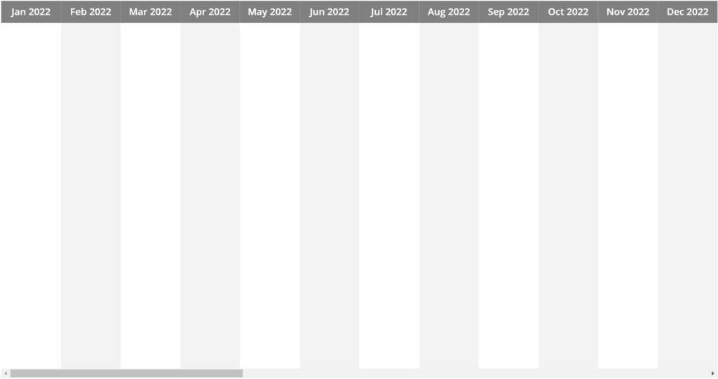
)The ID value we created will allow us to also define different background fills for alternating values. We can do this by making the TemplateFill of the gallery the following code:
If( Mod(ThisItem.ID,2) = 0, RGBA(0,0,0,0.05) )So now you should have a gallery that looks something like this:
Now we’re going to add a label and place it at X:0 Y:0, I will call mine lbl_MonthName_PS, and that label’s Width will be:
Parent.TemplateWidthWe will then set the text of that label to be:
ThisItem.MonthYearYou can then customize the Fill and Colour of the label, I have used a Fill of RGBA(128, 128, 128, 1) and a Colour of White. Your gallery should now look like this:
Now we’re going to insert a Flexible height gallery into the existing gallery (note: this should always be your default gallery for verticals as it can adjust its row height dynamically without making all other rows the same height), and we’re going to make the Items property of that gallery your datasource (in my case this is “ProjectData“)
We can then set the inner gallery’s Y value to:
lbl_MonthName_PS.Y + lbl_MonthName_PS.HeightNow we set the Height of the gallery. We accommodate for the height of the label above it and create a gap below it of the same height – this also accommodates for the scrollbars along the bottom, as we don’t want these blocked by the gallery otherwise we will not be able to navigate across the month-years:
gal_MonthYears_PS.Height - lbl_MonthName_PS.Height - Self.YThe next bit is more of a personal preference rather than an absolute, I will be setting the Width of the inner gallery to the Parent gallery’s TemplateWidth and multiplying it by the number of months we have included in the sequence we used for the Parent gallery’s items. I do this so that the inner gallery’s scrollable width matches the extent of the outer gallery’s month-years:
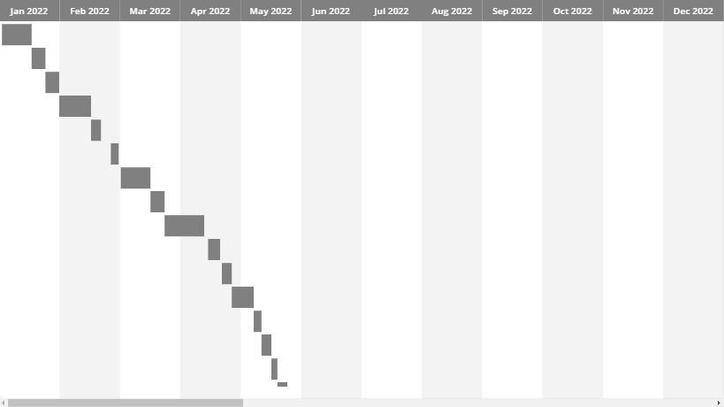
Parent.TemplateWidth*36Now we can add the two labels that will be doing the majority of the work. The first label, which I will call lbl_Indicator_PS, will be our ‘block’ that shows the length of the item (project in my case), it’s X value will be the following (comments included for clarity):
// Get the number of days between this Item's Start Date
//  and the First day of the year - in this way we are forcing
//  the start of the gallery dates to be our zero-point
Value(
    DateDiff(
        Date(
            Year(Now()),
            1,
            1
        ),
        ThisItem.StartDate
    ) + 0
)
// then we divide the gallery width by the length of
//  a year (including leap-year 1/4 day) to get single-day-units
//  and then multiply it by the day value we got above
*
(gal_MonthYears_PS.Width / (365.25))
Next we define the Width of lbl_Indicator_PS by getting the difference between the number of days between the StartDate and the EndDate and then multiply it by the same single-day-units we determined in the previous step:
// Number of days between the EndDate and the First day of the Year
(Value(
    DateDiff(
        Date(
            Year(Now()),
            1,
            1
        ),
        ThisItem.EndDate
    ) + 1
)
// Subtract from that the number of days between the StartDate and the First day of the Year
-
Value(
    DateDiff(
        Date(
            Year(Now()),
            1,
            1
        ),
        (ThisItem.StartDate)
    )
))
// Then we multiply that by the single-day-unit
 * (gal_MonthYears_PS.Width / (365.25))
Now, assuming that you’ve got some data with Start and End dates, your gallery should be showing these items as bars:
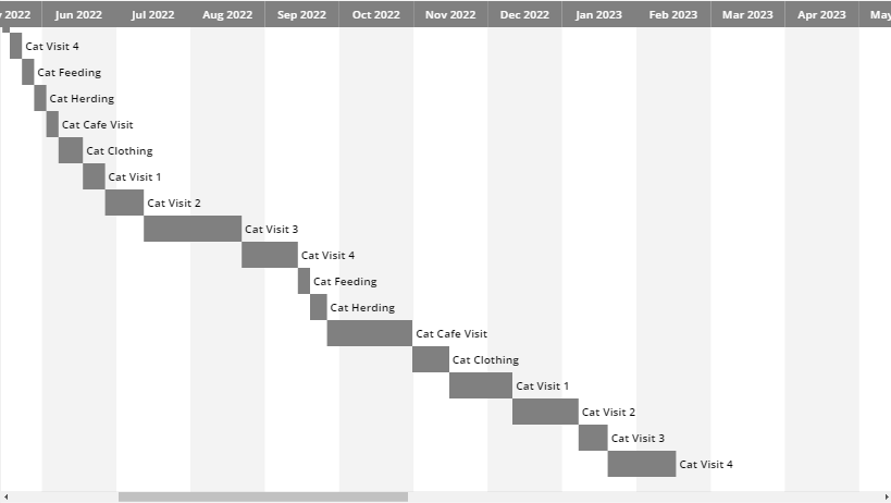
Our next step will be to add a label that shows the name of each item, I will call mine lbl_ItemName_PS. I am setting the Text value of my label to the Title field, but you should set it to whatever field you are using for the item Name. (We can add further details to the tooltip of our Indicator label later if we require more information to be available for each item)
The X value for our lbl_ItemName_PS label should be:
lbl_Indicator_PS.X + lbl_Indicator_PS.WidthFor the width value, I have taken an estimation based on my current font size for the label (13), which means the length of the Text multiplied by 20 makes sure that the label fits horizontally (there are other better solutions for auto-width labels, this is a quick-fix). Label width:
Len(Self.Text)*20I have additionally set the template padding for the inner gallery to zero, as this was causing gaps horizontally in the items that mis-aligned them with the month dates:
Conclusion
That’s it! You’ve done it!
I would highly suggest using collections for this kind of nested gallery situation, as reading data live from the datasource for all items and multiple properties will result in some performance overhead.
If we want to expand further on this, there are limitless things we can do 🙂
For example, my data has a Status field, so I can modify the Fill of lbl_Indicator_PS to show different colours depending on the status of the item, like this:
If(
    ThisItem.Status="Not Started",
    White,
    ThisItem.Status="Active",
    Orange,
    ThisItem.Status="Delayed",
    Red,
    ThisItem.Status="Completed",
    Green,
    Gray
)
The only limit is what you can imagine you want to use yours for!
You can find a copy of the App here, where I have also turned it into a simple component
Make sure to check out my other blog posts and feel free to follow/peruse my other socials etc from the icons at the bottom of this page 🐈


Hallo, wäre es möglich, dass Sie mir “Einfaches Gantt in Power Apps” als ZIP-Datei zur Verfügung stellen würden?
Mit freundlichen Grüßen Thorsten Rasic-Rudel
Thanks for your solution. I have apply to my application. But i would like to click detail item in inner gallery to show start date & end date in expand. I still can’t do it. How to get thisitem is selected in inner gallery ?
Hi,
I’d recommend raising this on the Power Apps Community forums, as I don’t have the scope/time currently to solve this. There are many Super Users on the forums that would be able to help you solve this 🙂
Your best bet it to raise it here:
https://powerusers.microsoft.com/t5/Building-Power-Apps/bd-p/PowerAppsForum1
Cheers,
Sancho
Hi Sancho,
Thank you so much for this solution. I’ve just recreated it in Power Apps but run into a potential bug.
I’ve noticed that the inner gallery does not expand to the full width of the outer gallery when previewed in the browser. The same thing appears to happen in your original solution too.
The best way I can demonstrate this issue is if you place a border around the inner gallery and preview the app. You’ll notice that the gallery disappears when you scroll to ‘Oct 24’. Even if a create an item that spans the full three years the gallery always disappears at that point!
I’ve been trying to troubleshoot this issue but cannot find a solution. Do you happen to have a workaround for this?
Thanks
Jenny
Hi Jenny,
Thanks for raising this – seems a bug was introduced to galleries since I first posted this – The items were no longer displaying past Oct the following year and think it was something to do with how refresh/redraw happens with them over widths for the TemplateSize.
I have put a workaround in place for you (by reducing the widths down to the approximate of 2 years rather than 3) and this seems to have resolved it.
I’ve updated the file on my GitHub – if you could please download that and give it a try and let me know if that sorted it for you
Cheers,
Sancho
I’ve tried implementing this however, my dates don’t span over several months they repeat for every month obviously something at fault with the nesting. Could you give me any hints?
Hey Rhys,
Did you try opening the App I included within the blog? Might be worth going from there and adding your data, then using that to recreate the component in your own App as you could then compare them side-by-side.
If you have already done that, could you let me know a bit more about the data you’ve used in each layer and the formulas you are using for Datasource/items/etc. ?
Cheers,
Sancho