
Power Apps Forms Tips and Tricks – Part 1
Hello everyone, I hope this series of articles provides you with many of the Tips and Tricks I commonly use when utilising Power Apps Forms.
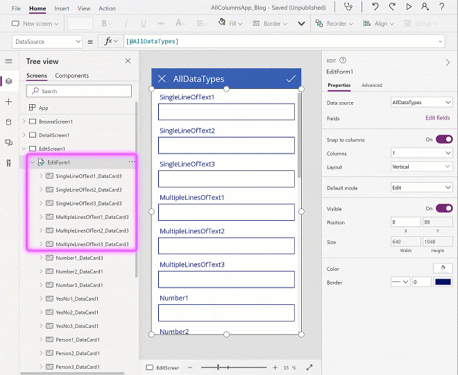
Trick #1 – Select Multiple Data Cards
The first thing everyone should know.. is how to select multiple data cards.
Why? Because unless you are using my branding template (or similar template), setting the bordercolor property for each individually takes time and many of the interior controls on a form use Parent.Bordercolor to define their own bordercolor, which is then used to define the hover and pressed bordercolor properties.
STEPS:
Select a single data card, then hold shift and select a second data card.
This will now look like only the second card is selected.
If you hold shift and click other cards now (including the first), you will be able to select multiple cards and change their properties simultaneously (in this case we have done Fill, although I would usually set the bordercolor)
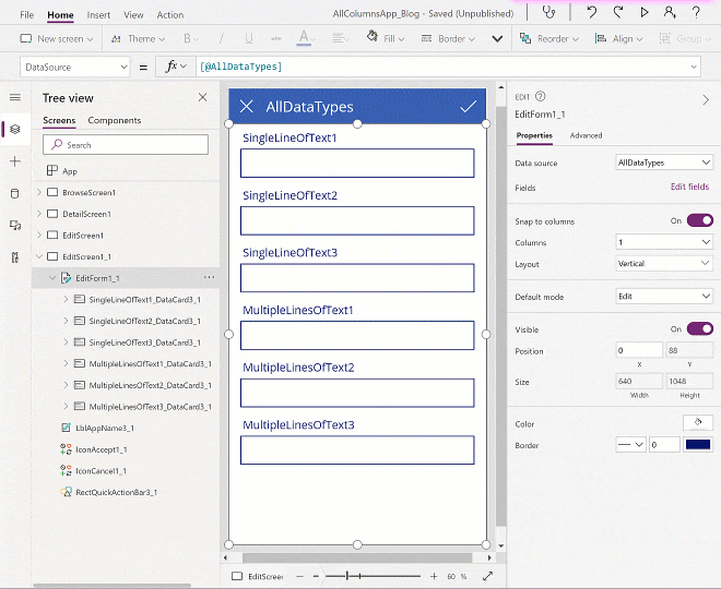
Trick #2 – Select Multiple items in multiple datacards
Next up we have selecting multiple items within Multiple datacards!
Same as above, unless you are using my template or have created your own based off of that concept, then you will need to edit the item properties of each control within a form individually. This is time-consuming and there is a better way to do it if you must do it manually.
This method should ideally be done AT THE START of building your form, because the method involved resets many properties (specifically coordinate and size properties are of concern) of the datacards, which we will overwrite later.
STEPS:
Select your form at its top-most level, then change the orientation of the form (ie from horizontal to vertical or vice versa).
Hit the undo button.
Now you can use shift+click to de-select further items from within the different datacards.
(additional tip: try selecting all items of identical control-types, you can then access properties that are present across all of them and change them simultaneously – in this example I have done font size, color and Fill)
Tip #1 – Using Custom Controls to replace the defaults
Generally speaking, forms all end up looking similar very quickly unless you have someone involved who has good design skills or UI/UX experience, however, anyone can add some dynamic to their forms by either replacing the controls with a different type or by having a secondary layer of controls that modifies the base controls.
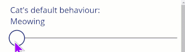
The first example I’ll give is a slider for ratings, based on a SharePoint Single Line of Text column.
(Slider for text ratings/choices)
STEPS:
Unlock your DataCard,
Insert a slider control,
Set its minimum to one, and its max value to the number of choices you will be presenting (I’ll set 3).
Set the Slider’s ShowValue property to false (this hides the numbers)
Set your Text Input controls default to (replacing appropriate values):
If(
   Slider1.Value = 1,
   "Meowing",
   Slider1.Value = 2,
   "Purring",
   Slider1.Value = 3,
   "Scratching"
)
To ensure the default values or returned when editing an existing item, Set your Slider control’s default to (replacing appropriate values):
Switch(
    Parent.Default,
    "Meowing",    1,
    "Purring",    2,
    "Scratching", 3
)
We can now also hide the original text control by setting its visibility to false.
Then we can display the value in the actual Title label using the following (inserting the same code we used for the Text Input):
"Cat's default behaviour:
"
// We included a line-break by pressing Shift+Enter above

&
If(
   Slider1.Value = 1,
   "Meowing",
   Slider1.Value = 2,
   "Purring",
   Slider1.Value = 3,
   "Scratching"
)
Please note that in my actual App I have used appropriate naming and a naming convention, i.e.
control_FunctionalName_ContainerName_Screen
“sld_CatState_EditForm1_EditScreen”,
“lbl_CatStateTitle_EditForm1_EditScreen”,
“txt_CatState_EditForm1_EditScreen”
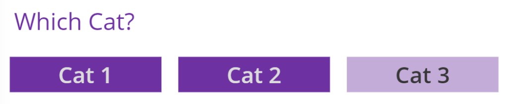
(Gallery of labels as ‘choice’ selection)
STEPS:
This can be really useful for small numbers of choices i.e 2 to 6 choices (depending on how wide your form is, and what your wrapping setting is set to)
Unlock your DataCard,
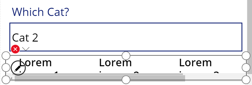
Insert a Horizontal Gallery into your DataCard,
When you first try this, it will insert the Gallery ABOVE/OUTSIDE your form,
Cut (Ctrl+x) the gallery,
Click inside the DataCard and Paste (Ctrl+v) the Gallery back in,
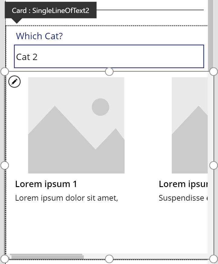
Delete the Image and SubTitle,
(Now we get the sizings sorted out),
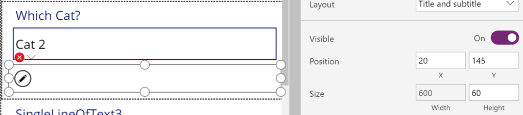
Set the Height to an appropriate level, I will set it to 60 as I’m using mobile format for this example,
Set the Gallery’s width to Parent.Width-40 (this gets us a 20 gap on either side, because: 20 from left, 20 from right),
Set the X value to 20 to complete the ‘side gaps’,
Set the TemplateSize to Self.Width/3 to divide the gallery into ‘columns’ (or divide it by however many choices you would like per row) – TemplateSize defines how wide the individual Gallery ‘items’ are (we can see the default sample text now showing),
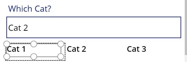
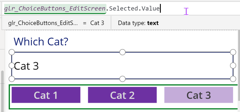
Set the Items property to [“Cat 1”, “Cat 2”, “Cat 3”] to complete the changes to the gallery – we put this in square brackets to define it as a Table, and we can add as many items as we want – we are giving the user forced choices while still filling a text field.
Set the default value of the Gallery to {Value: Parent.Default} as the gallery is looking for a Record as its default and the column type for the data source is a single line of text. {} defines that its a record and then we are defining the ‘Value:’ as our Items for the gallery haven’t been given a defined name and thus default to the standard name for unstructured data: Value.
We can now start our changes to the Label.
Set the Height of the label to Parent.TemplateHeight * 70%
Set the Y value to (Parent.Height-Self.Height)/2 (This is taking the Height of the label and the Height of the gallery and then halving the difference, so a gap above and below that is half the difference)
Set the Width to Parent.TemplateWidth – (Parent.TemplateWidth*10%)
Set the X value to Parent.TemplateWidth*5%
Now we can do the cosmetic changes for the label:
Set the Horizontal alignment of the text to Centre.
Set the Vertical alignment to Middle.
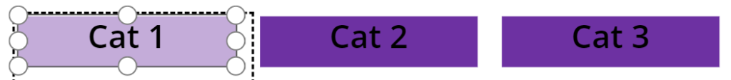
Set the Fill value to:
If(
   ThisItem.IsSelected,

   // Set a lighter Fill if this is selected
   ColorFade(RGBA(109, 49, 162, 1), 60%),

   // The fill for items that are unselected
   RGBA(109, 49, 162, 1)
)
(This changes the selected item to a more highlighted colour so that its easy to see which item is selected)
Set the Color value of the text:
If(
   ThisItem.IsSelected,

   // Set the Selected text Color to contrast the Fill
   RGBA(55,55,55,1),

   // Otherwise the Color should contrast the alternative Fill Color you set
   RGBA(220,220,220,1)
)
(This sets the text colour for the item that is selected to contrast the selected background and the unselected likewise)
Set the HoverFill to ColorFade(Self.Fill, 20%) to show that the item is interactive:

Now we just need to set the text input’s default to GalleryName.Selected.Value
Lastly, we hide the original text field. I personally like to set its visibility to a variable ‘ShowHidden‘ and that way, when I need to do debugging, all I need to do is switch that variable to true to see all of my hidden items.
Tip #2 – People Picker Default Selected item for Current User
This one might not be a huge time save, but it certainly is neater than some of the other solutions I’ve seen.
When using a People Picker control, you can actually default the control using a Record {} and the email address of that person. If we want it to default to the current user then we only need to use User().Email – Another tip is that you should also set a variable that contains the User() function’s detail.
Set( UserDetails, User() )
To have the default value for a Combobox be the current user set it to:
{
DisplayName: UserDetails.FullName,
Claims: “i:0#.f|membership|” & UserDetails.Email
}
That’s all the Power Apps forms Tips and Tricks for this Article as I didn’t want to cause information overload for anyone.
If you liked Part 1 be sure to follow me on Twitter for notifications about the upcoming parts.
You can find my other posts about Power Apps here.


I’ve used a Gallery to provide a set of Tabs, one of which may be selected at any time. To emphasise which Tab is selected I’ve provided a Height property such as
If(ThisItem.tabNo = ActiveTab, Parent.TemplateHeight*0.8, Parent.TemplateHeight*0.7)
Update:
I incorrectly stated Parent.Height instead of Parent.TemplateHeight in the following piece of code and have corrected it:
“Set the Height of the label to Parent.TemplateHeight * 70%”